
Back to the work
07 / 08 Ice cream
isola
Ice cream shop · Mosede Havn, Denmark
Four flavours, four universes, one scene.
02 The project
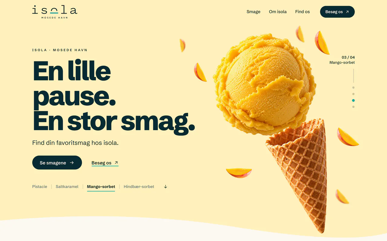
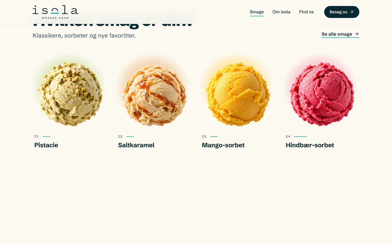
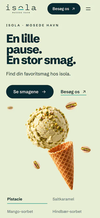
An ice cream shop by the harbour in Mosede. The page opens on a stable composition, the headline on the left and a scoop suspended over a waffle cone, and lets the flavour change around it: pistachio, salted caramel, mango and raspberry, by scroll or with the selector.
03 The direction
- Composition
- A scoop at the centre, ingredients in orbit and plenty of light space.
- Typography
- Schibsted Grotesk, in short sentences and in the shop’s own language (Danish).
- Colour
- Dark ink and turquoise, with a colour of its own for each flavour.
- Central gesture
- The flavour changes within the same scene, and the scoop docks into the cone.
The site’s palette
- Ink#082A32
- Turquoise#00A99B
- Pistacie#E8EED4
- Mango#FFF0BD
- Hindbær#F9DDE2
Typefaces
Schibsted Grotesk
04 The interface
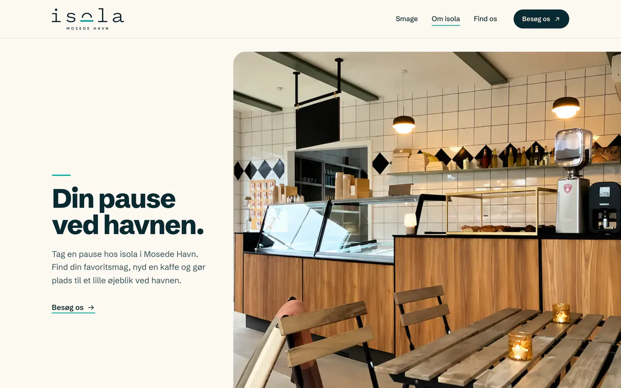
Phone
05 The motion
- 01 Pistachio
- 02 Flavour change
- 03 Into the cone
Pistachio, salted caramel, mango and raspberry take turns in the same scene; at the end the scoop docks into the cone and the group glides into its card in the flavour catalogue.
06 What I did
Visual direction, interface, motion and development.